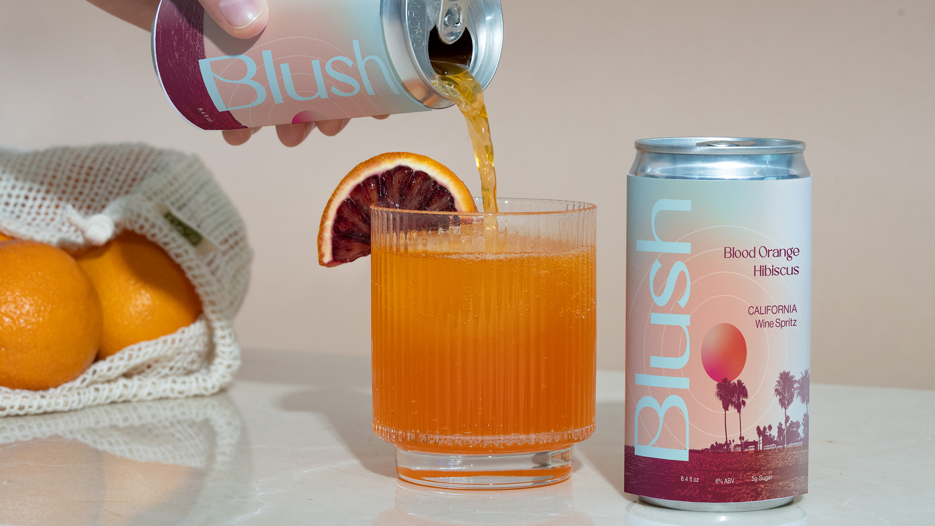
The concept design for Blush, a sparkling flavored canned wine, builds upon the initial branding idea and aims to immerse consumers in the quintessential California lifestyle. The vibrant palette of cheery blush tones, alongside complementary colors like soft greens and sunny yellows, draws inspiration from vintage California landscapes.
Each can features stylized photography of iconic Californian landscapes, such as Santa Monica Pier, Joshua Tree and Yosemite Valley. This not only emphasizes the outdoor aspect but also serves as a visual celebration of the diverse beauty found within the state.
The typography will reflect a modern yet approachable feel, utilizing elegant fonts that evoke a sense of sophistication. Cheeky catchy phrases or uplifting slogans adorn the cans, reflecting the themes of connection, with a hint of flirtation—encouraging consumers to gather with friends, sip bubbly wine, and share joyful moments together.
Overall, the expanded design concept for Blush not only showcases the vibrant spirit of California but also reinforces a lifestyle of connection, joy, and outdoor celebration, inviting everyone to embrace the essence of California living, one sparkling sip at a time.
The combination of vibrant blush tones—from soft pinks to lively corals—paired with complementary pastels and neutrals will create a visually engaging experience that embodies the carefree essence of California living.
These gradients of color transition seamlessly between warm pinks, soft oranges, and gentle purples, mirroring literal blush tones, as well as breathtaking skies that capture the essence of outdoor gatherings at dusk. The gradual blending of colors can create a dreamy aesthetic, ensuring that the cans stand out on the shelf while also captivating consumers’ imaginations as they visualize unforgettable evenings spent sipping bubbly wine under vibrant skies. Neutrals like sandy beige ground the design, allowing the vibrant colors to pop without overwhelming the senses.
The typography maintains an elegant yet minimalistic style, using clean lines and refined serif and sans-serif fonts that convey sophistication without losing approachability. The contrast between modern typography and rich imagery will allow the photography to be the focal point of the design - making each can not just a beverage container but a piece of art that consumers feel excited to share and showcase.
In essence, the design concept for Blush seamlessly combine vibrant colors, minimalist typography, and colorful illustrations to create a cohesive visual identity. `
Glorien San Serif
Neue Haas Grotesk
Packaging, Social Media